
Charlie Loyd @vruba@everything.happens.horse
- charlie@planet.parts
- work
- geographical pixels
- where
- Xučyun/Oakland, Ohlone land, western Laurentian accretions
- who
- him
You know him on the internet. Eucalypt-adjacent; very occasional writer. Consulting and passively looking for work in geospatial, image processing, and related fields.
Joined Apr 2022
Messing with sliced optimal transport cartograms again.
Charlie Loyd
boosted
Reflecting once again on how much more pleasant and illuminating online discourse would be if people simply put aside their self-regard and took the time – before commenting on anything – to sit down and learn to see everything exactly as I do.
Charlie Loyd
boosted
[Looking at a society where decision-making power is strongly inversely correlated with exposure to the consequences of one’s decisions:] Now hang on, why are there so many bad decisions?
Charlie Loyd
boosted
A little unexpected good news: I spent 90 seconds looking into the thing in the news and it turns out it’s actually really good evidence of the veracity of an opinion I already had.
Charlie Loyd
boosted

I'm nearing the end of a two-month residency at MakerLabs, a community fabrication space here in East Vancouver. I'll write and share more about it online soon, but if you're in the Lower Mainland, please come out this Wednesday, February 25th from 7-8:30pm to see what I've been up to, along with the rest of the cohort!
Link + RSVP: https://www.eventbrite.ca/e/tools-for-change-showcase-meetup-tickets-1974947151093
Charlie Loyd
boosted

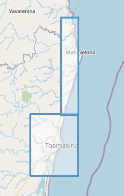
NEW Vantor Open Data for Cyclone Gezani impacts in Madagascar
Allow me to recommend the Soviet production of Sherlock Holmes on YouTube. As an index of its vibe, this is how it depicts a man who has just arrived from Canada.
I am still a novice at Rust but it’s hard to emphasize enough how non-annoying it is in general.
I’m not a big PL nerd, but rarely do I think “oh, the people who put this together actually thought carefully about it” – Scheme, Postscript, HyperCard, Haskell maybe (I don’t know it well enough), and precious few others.
Rust feels like a low-level language designed by people who understand and sincerely appreciate current-millennium high-level languages instead of feeling insecure about them.
Charlie Loyd
boosted

The documentation for this image processing library is one of the most interesting things I've read in weeks:
https://github.com/celoyd/potato/blob/main/docs/personal.md
https://github.com/celoyd/potato/blob/main/README.md
https://github.com/celoyd/potato/blob/main/docs/concepts.md
Philosophical discussion of the nature of seeing and what am image is vs a map, fascinating technical details about how satellite imaging works and why it looks as bad as it often does, a lot of really thoughtful conversation about engineering and aesthetic process, and even an amusing unit of measurement — grams per terrapixel.
Charlie Loyd
boosted
You know when someone says something like “My therapist let me know a really interesting trick:” and then they say something that’s an obvious solution to a problem you cannot imagine having? You’ve seen a little too deeply into their worldview? This is how a lot of year-end lists come across.
Charlie Loyd
boosted

Happy holidays, fediverse!
I got you a megathrust earthquake, soil liquefaction, spine-tingling papers about the way our networks confound knowledge, and a PDF in a pear tree. It's my wrap on a year of trying to make sense of how we make sense of what's happening to us.
The most important part of Potato for me is its colors. For more than a decade, in several workplaces, I’ve griped about how standard pansharpening renders colors. It’s been gratifying to show what I think is a better way.
So if you work with satellite imagery, I hope Potato makes good holiday reading. If you don’t, I hope it gets you interested. And if you’re hiring for skills shown in it (chewy, cross-disciplinary spatial/visual/etc. work), drop me a line.
There’s a lot in the repo, but I’m happy to say the core code is small and efficient. You can pansharpen several megapixels/second on an ordinary CPU, and somewhere > 10 Mpx/s on a gaming rig.
It's all licensed CC BY-NC, like its training data: Maxar/Vantor’s Open Data Program (h/t @marcpfister). This is imagery for disaster response, and a goal of Potato is to publicize that data, and similar data, and to encourage work that makes it easier to use.
It’s got a lot of moving parts and I wanted to make it intelligible to several audiences, so the documentation is a bit much at times.
I’m not expecting most people to know what pansharpening is, or to have a pressing need to do it themselves. But it’s an interesting problem, and I hope it’s interesting to learn about. It’s taken a lot of inspiration from across domains (by movie colorists, for example).
I’ve been working on this occasionally for years. It’s been a weekend morning here, a notebook page on the bus there, week-long sprints between contracts, etc. Eager to learn what hugely embarrassing bugs I’ve left in it.
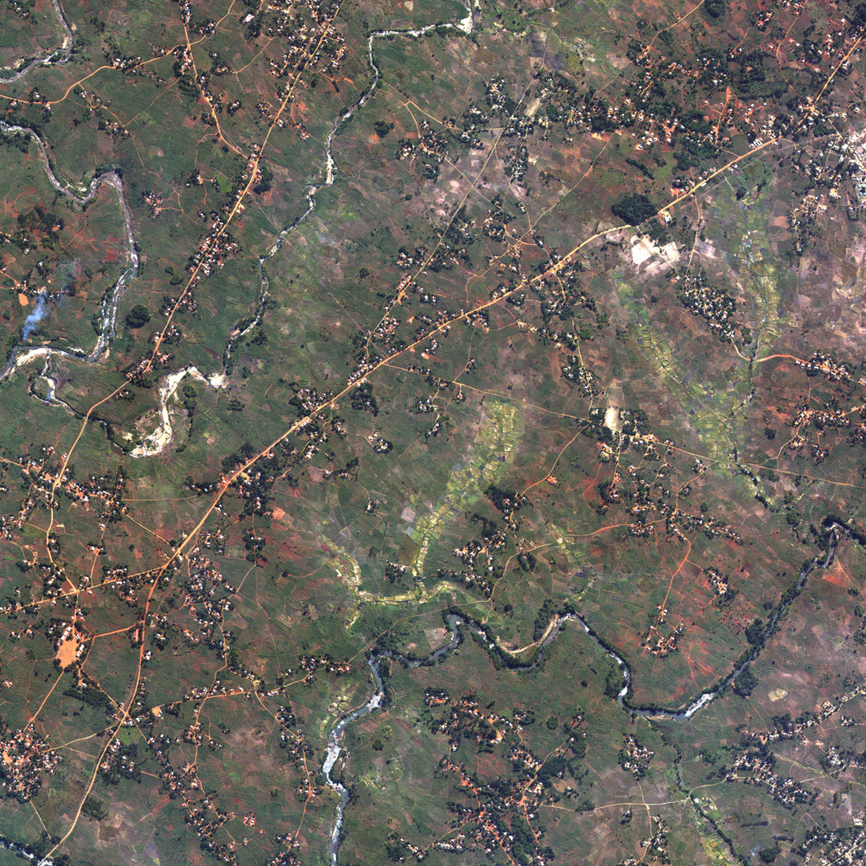
I’ve just published Potato, a new pansharpening package. It aims to render certain kinds of satellite imagery more clearly and accurately than what’s for sale and on satellite maps today: https://github.com/celoyd/potato/
It’s under 50k parameters, comes with a working checkpoint, runs on a home computer, and is specialized on WorldView-2/3 ARD imagery. It does a few things I haven’t noticed before in the literature: for example, using all the visible multispectral bands to make its visible colors.
It’s called the Getty Museum open data because it lets you get the wait no because you can freely be getting the no hang on okay because you can museum the gotten no I messed it up again but seriously folks you can “got” the artworks aw shit
https://mastodon.social/@creativecommons/115532158945263774
Technically this is a type of phase diagram.
https://pixelfed.social/p/Atanas/895754272486310141
Charlie Loyd
boosted

If you live in northern Arizona, you can go to this and have my eternal envy. This Saturday, FIVE young California Condors are being released into the wild at Vermillion Cliffs national monument, and the public can come see them fly! (It's also going to be livestreamed, which is how I will watch!)
#birds #vultures #SomeGoodNews
https://peregrinefund.org/event/2025-california-condor-release-sep27
Everyone’s going to be grateful for my explanation of satellite imagery data pathways if I make it look like a category theory diagram without actually using the notation correctly!
- charlie@planet.parts
- work
- geographical pixels
- where
- Xučyun/Oakland, Ohlone land, western Laurentian accretions
- who
- him
You know him on the internet. Eucalypt-adjacent; very occasional writer. Consulting and passively looking for work in geospatial, image processing, and related fields.
Joined Apr 2022