
Inspired by @pnorman’s animation, here’s a year of daily OpenStreetMap tile traffic. One frame per UTC day, from the start of September 2022 through end of August 2023. It’s from the public log aggregates, so some low-traffic tiles are left out for (I assume) efficiency and privacy.
Woops, the tag didn’t work in the original post. Credit to @pnorman for the idea.
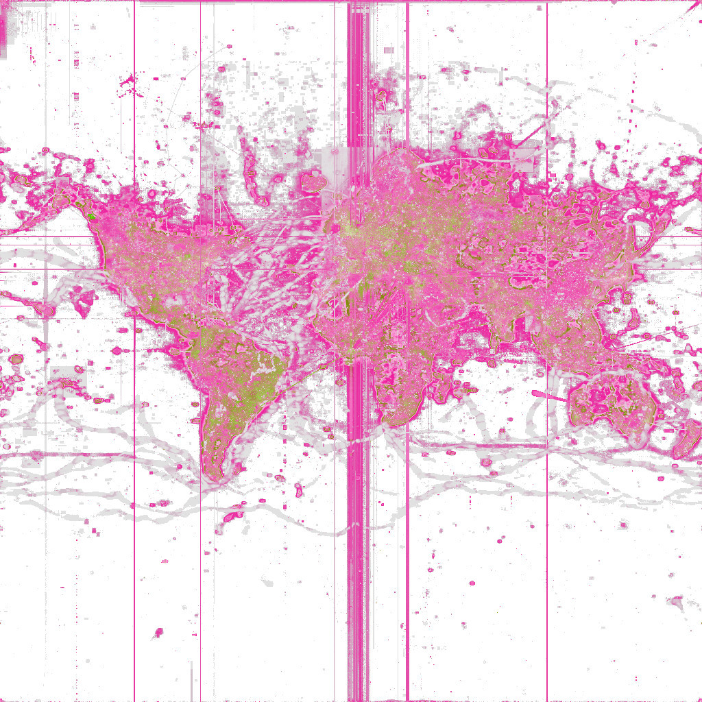
Same general idea and source data, but this time it’s just z-score (https://en.wikipedia.org/wiki/Standard_score), with red positive and green negative. Hard to say that this makes it easier to spot the interesting anomalies, but it seemed like the common sense thing to try. You can see the the OceanGate incident, the earthquake in Turkey and Syria, probably some festivals, etc.
Ideally you’d have this over a basemap and with both dimensions (number of views and view anomaly) visible, but I will generously allow someone else to worry about that.
Okay, fine, @jonty cajoled me into it. Lighter is more traffic; warmer is more positive anomaly for the day.
Now, certain nerds and haters might squint at this and say “It looks like you did this in oklab color space and then tried to half-ass some gamut mapping when you remembered that a lot of the highest z scores are in places with very low traffic counts!” and I would rebut that in scrupulous detail with one simple argument: Good night.

@vruba I like it! I love happy accidents like this and the palette is remarkable.

@vruba Juuuuuuuuust right.


@vruba Spectacular work

@vruba I mean I was going to say, (I wasn't but it's fun to think I could've if I knew how, so I'll just say, wow! cool!).

@vruba I like the rays fanning out from null island that are likely leaflet panning to the desired location.

@vruba Yep those are my questions!

@vruba I can guess the questions for the first four answers, but…
@mirabilos “Are the tile counts nonlinearly scaled for coloring?” and “Why don’t you try [something else]?”
@vruba thanks, this even got me into learning about Zipf’s law a bit.
@vruba this is fantastic!

@vruba My question is: where did you get the idea to use OSM tile traffic data as seed conditions for Conway's Game of Life?
@alan I feel like this could be the seed for a legitimate geography paper in like 1977.

@vruba the yacht races are spectacular


@vruba the pulsing happens in week(end) freuency I guess?


@vruba Ah, the lodestar of null island. A shining beacon of hope and http requests.

@vruba The route of The Ocean Race is clearly visible. Their public yacht tracker used OSM as one of the map options.

@vruba What did you use and what settings to encode the video? That's the problem I've always had, I can't find a good ffmpeg command line to encode it.
Are you doing color based on log(requests) or scaling a different way?
@pnorman This seemed to work acceptably: ffmpeg -r 15 -f image2 -pattern_type glob -i "png10/*.png" -vcodec libx264 -tune grain -crf 15 -pix_fmt yuv420p -movflags +faststart osm.mp4
And the value scaling is basically log8, entirely ad-hoc.

@vruba Null Island is fascinating: https://en.wikipedia.org/wiki/Null_Island

@vruba I’m loving the artifact from (0,0).

The answers to your questions are:
1. Yacht and rally car races.
2. Yes, well noticed! We call it “Null Island”.
3. No, but it would be nice if it were practical.
4. People scraping tiles.
5. Yes, because the distribution of traffic follows Zipf’s law.
6. If I have time.